STORYSPACE: Brimmer and Death – Structure
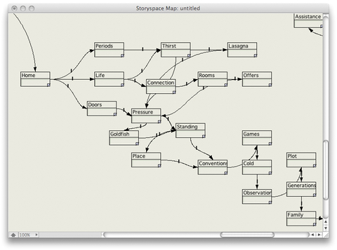
In going over the mapview of this story by Steve Ersinghaus, I can see the intricate manipulation by the writer to direct the reader to cover all bases even while allowing him/her to select direction by choice. This may visually help answer a question raised by Mary Ellen and addressed by both Steve and Mark Bernstein in this post on Hypertext Aesthetics. She asks: ““I worry constantly that I’m not getting the essence of the story because I don’t know how the writer crafted it.”
Mark responds: “Just as a bard might extend some scenes and foreshorten others, the hypertext writer has (we hope) carefully arranged the links and anticipated your reading.”
I think the map below of a portion of Brimmer and Death reveals the planning that goes into hypertext. If a space or thread is missed because of reader choice, it indeed will change more than the experience of the story, it may change the meaning, mood, or tone. That is both the author’s concern and intent. In the same way, he will ensure that nothing of importance is lost to the reader by his/her own calculations. Note how the writing spaces are linked so that nearly all spaces of this map will be available and read, though not in the same manner. Sequence, then, is key.
As they say, sometimes a picture is worth a thousand words.


 The Lost Children: A Charity Anthology