Posts Tagged ‘STRETCHTEXT’

HYPERTEXT & STRETCHTEXT et al: Ah, the problems start…

Sunday, October 24th, 2010


UPDATE: Did get the image to work, but only as the target from original text links–as opposed to stretchtext hidden text links. Haven’t checked it with IE and Chrome yet, but it works in FF and Safari. Haven’t done anything with the font color problem yet since it works in two out of four browsers and that’s likely an easier problem to fix.

Just when I thought I was hot shit getting all that stretchtext working properly I exported the piece to the site online and problems immediately came up.

While I work with Firefox to open the html pages offline, I still needed to see the flow of the narrative when sticking in the images on a more occasional basis, since once the stretchtext is in the Tinderbox form, I can’t see where they are (including them into the main text of the box from whence they emerge), and in the file exported to a desktop file, they are arranged alphabetically rather than by narrative flow. Once the pages were set with the stretchtext code and the font, sizes, etc. were pretty much decided and working, and Firefox opening the file on the hard drive worked the images open in stretchtext, then I exported the project online. And the fun began.

In Firefox, the images don’t show up. In Safari, something worse; the stretchtext seems to have lost it’s font color in the middle paragraph of three–though two paragraphs will hold the color:

Then I went over to the PC and with Windows XP and Internet Explorer, found that only the first paragraph held the font color while subsequent paragraphs returned to white, even though the closing font tag was not until after the last paragraph.

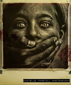
The image, in Firefox showed nothing, in IE and Safari showed the empty place-holder box:

So I downloaded Chrome on the PC. It handles the font-color code, but not the images. Chrome also didn’t display the Rockwell font very well, almost made it unreadable while it was fine in the other three browsers. So that’s four browsers and two of them have trouble with the font color changes and all four have a problem with the images. The colors, BTW, are your standard #ffffff, #000000, #ff0000, #00ff00, and #0000ff.  Looks like I’ll be doing some work on this today. But then this is one of my strong points, I love to track down problems and solve them. I’m just a bit slow.

HYPERTEXT PROJECT 1 & STRETCHTEXT: Making it all work

Sunday, October 24th, 2010


Had to export the new Bottle of Beer online to work with it since the new Tinderbox version doesn’t show the stretchtext and the html templates don’t show the hypertext flow. It’s easier to see where images might be effective in the linear flow of the work, and in the hard drive file of html pages, the files are alphabetical.

I do have a problem. While the stretchtext seemed to easily accommodate the images while I was working with the local files, once it was exported onsite, the images weren’t being called in. I’ve tried a couple different browsers (I use Firefox normally) such as Safari and IE, but so far, it doesn’t work. I’ve also changed the coding to reflect “url” though I’ve yet to type in the whole url, and I’ve changed the file location from a separate images file to standing within the whole “abob” file.

Switched the font to Rockwell which is a bit more readable in the colored text on black than Georgia was, and a bit more classy than the Lucida Grande I was using.

Found the no-repeat coding for the images on the background, though I still can’t seem to tweak the right lines to make the image go all the way across the screen nor have some top margin. But an alternate way of working with the background images is to produce a black screen in Photoshop and drag in the image and place it where I want it, such as this:

HYPERTEXT & TINDERBOX & STRETCHTEXT: Two Quick Fixes and Some Ideas

Thursday, October 21st, 2010


On the centering of the image, I just added in: margin-left: 50px;  in the css under .stretchTarget  –  With a body width of 600px and setting the images at 500, this should center them. This also moves the text, but that’s fine with me for now; I kind of like the offset (though 50px is high and not as necessary with the text color change in this piece). That may defeat the effect of stretchtext, but at the same time, it offers a visual border separating original from hidden which may better serve the reader. In any event, I can as well make the images larger to come within 5-10px of the borders. Then again, all of this changes when I drop the box outlines I seem to still love so much.

In Tinderbox, I was unable to see the actual text of the note in the HTML View on this piece for some reason and added: ^text^ in <div id=”text”>^text^</div> in the html template and that solved that problem.

While I’m getting the piece into its new format, I’m also thinking on:

  • Hidden images with clickable text – where the image would be very light and vague but the text would read normally.
  • Moving the hidden text/image/whatever to a third (or whatever) column, out of alignment of the piece.
  • Adding in audio and moving visuals.

There were a few more–but I can’t recall right now. I’ve also added STRETCHTEXT to the Categories and Tags here for easier retrieval.

HYPERTEXT: Adding in a “hidden” visual

Wednesday, October 20th, 2010


Rolling along now, though I’ve got to go back and do some work on the piece as a whole, starting with the Tinderbox version of it, but I just found that I could “hide” an image and have it fade in via the same code I used for the text basically. Here, the “hidden” text is in blue and has been clicked to reveal, and as it included the final sentence (see previous post) the link in red “nightmare” calls up the image:

There’s still some tweaking to do, likely on the css sheet, to adjust the image size to allow some padding on the sides, but the code looks like this.

HYPERTEXT: Making Lemons into Lemonade

Wednesday, October 20th, 2010


This morning everything just sort of fell into place with learning and maneuvering the stretchtext code. Even in my sleep I think I was already planning my next moves so that dark and early at 5:30 a.m., I could get right on the project and make things work as I wanted them to do.

A bit later, I was able to post the link to one of the pages  in A Bottle of Beer called “Kismet Slept.” The linear narrative is in the tan text, the links and the text color of the hidden text go according to the themes (in the examples below, green = Yolanda’s past, blue = nature). It all worked and I was thrilled. Then I noticed an error:

Original page display:

Clicking the blue link “ghosts”:

The final line “It was the nightmares that threatened her dreams.” is part of the linear story and was meant to show up on the initial display. Why didn’t it? Because of this:

Note that the <div class=”stretchTarget two”> tag was inadvertently left open. What this did was keep that last line as part of the hidden text rather than the original. The </div> tag should rightfully have been right after the </font></p> of the paragraph ending in “moon.” However…

…while this is an obvious error, it is one that creates a writing device that can be used (if I remember it!) to advantage in telling hypertext story.

One of the questions a new reader of hypertext asks is “Do I read the whole space before I click a link or should I click the link when I come upon it?”  Well, this little mistake may have just helped me out, almost acting like a Storyspace “guard field” to prevent reading something before something else is offered to the reader.

In this case, that last sentence has a much more dramatic effect being available only after the hidden text is revealed rather than being displayed on the initial screen. So while this may not be an often-used tool for the writer, it is one that can create an effect and give much more control to the writer in particular instances.

It works particularly well here since the hidden text themes have such subtle connections to the main story and this way, it brings the reader back to the main narrative by reading a new line of linear text that he hadn’t read before and may mentally block out or scan over had it been available in the opening page.

HYPERTEXT: Yay!

Wednesday, October 20th, 2010


Okay, so I have all but the moving of the text which I’m not sure I can do but I think I can figure out a way.

Here’s a page from A Bottle of Beer employing stretchtext, color changes (which may still be fiddled with, as well as font for easier reading) in two events and in different colors–which for this piece, is vital.

Kismet Slept

HYPERTEXT: Stretchtext

Tuesday, October 19th, 2010


Finally got to spend some focused time on this and managed to get my text to stretch.

I’ve had some direction from Steve Ersinghaus and his example in his wonderful poem “That Night I Saw on my Homeward Way” (Published in Drunken Boat #10) but was never able to really understand how it worked, what files I needed and what code went where. It would have been easy enough to just copy, but I really didn’t understand what I would be doing.

After reading the Dummies book on jQuery, things started to make sense. I began to comprehend how jQuery is like a special instruction to modify the set instructions for the piece, just as special instructions as to color, text, spacing, etc. changes are placed in the header section to override the css.

Using A Bottle of Beer as my project, I’ve so far put in just one of the two spots that will employ stretchtext.I’ve yet to figure out putting two in the page, change the color of the background and text–or at least just the text, and, if possible, make it come out of the side rather than straight down.

As soon as I do a bit more work on the color and style, I’ll export and link the page to a post, or figure out how to make it work within a post.

HYPERTEXT PROJECT 2: Presentation

Sunday, October 10th, 2010


This may be a model for the presentation of this project, a book called I Live in The Future by Nick Bilton.

HYPERTEXT PROJECT 1: Stretchtext and A Bottle of Beer

Sunday, September 26th, 2010


Would that it could mean what it sounds like, but not so.

In my pile of “Learn How To Do” has been the element of using stretchtext in a piece, and while I’ve got several places to learn it from, my mind unfortunately hasn’t quite grasped the concept of how it is actually accomplished. It’s a string of code that goes…someplace. Surely in the CSS itself, but also with references within the templates themselves in the particular spot where it’s needed (or wanted; stretchtext is no more needed than much else in life besides food and water and sex).

What I’m going to do then, is quit fiddling around and draw it from the back of my head to the forefront, somewhere just behind my third eye (why–don’t you have one?) and set up the project today to start seriously working on it. Easier then, to start with a piece already written and the perfect one for this is A Bottle of Beer, one of my longtime favorites that I’d written a few years ago, first at Hypertextopia, then into Storyspace which I much prefer of course because of its potential. I don’t have it in Tinderbox, but that may be the first move I make just because I’m more familiar now with this incredible program.