HYPERTEXT et al: Almost There

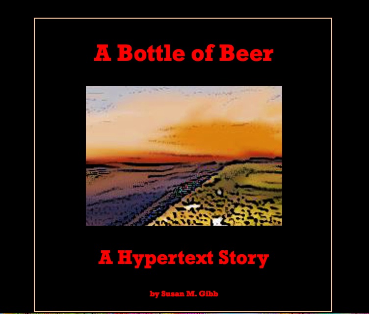
Have finally spent some time yesterday on finishing up A Bottle of Beer. I’ve included images I’ve taken myself and Photoshopped into more artistically (some, not all are done well–I’ve gotten some confidence since several of my graphics have now been accepted for publication!) suitable visuals and managed to get them to “hide” and “unhide” via stretchtext.
It’s likely the “flashiest” piece I’ve done, and likely that is because it was first written into Hyptertextopia and that was their basic color choice–black background and brightly colored links. But it suits this piece, and while I’m tempted to explain that the colored text that is revealed via links are the themes and separate from the main (white text) narrative, I suppose I’ll have to “Barthesize” and let the reader figure that out. And love it or hate it.
I’m still working on the problem of the hidden text not remaining consistent in color in Safari and Internet Explorer. I’ve solved it by adding the font tags to each paragraph. I’ve still to check if the stretchtext works in IE and Chrome. It works properly in Firefox (which is what I use) and in Safari so far. (UPDATE: Chrome showed up two open font tags but everything else was okay–odd that Safari and Firefox automatically closed them. Also, in working on the other PC with a larger screen, didn’t realize my background images set at 1280 x 800 weren’t sufficient. Have to work on that so that not too much relevant stuff is cut out on the right hand side. Maybe need to float or code to fit screen?) (UPDATE #2: Downloaded and tried Opera and everything works.)
Learned a lot, and am happy that this piece–aside from the tweaks and maybe some image changes–is finally displayed at its best.

 The Lost Children: A Charity Anthology