HYPERTEXT & CODE: Success!
This may not mean much to anyone but me, but I’ve just learned a lot:
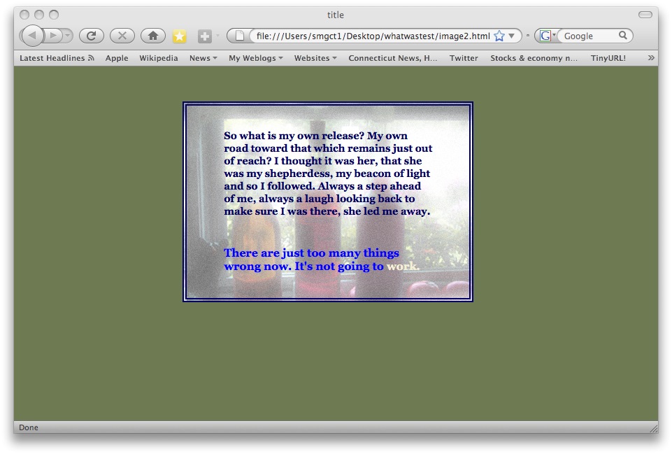
No sooner are the words out of my mouth than I go back to the problem that’s had me stymied and find out that overnight something made it work:
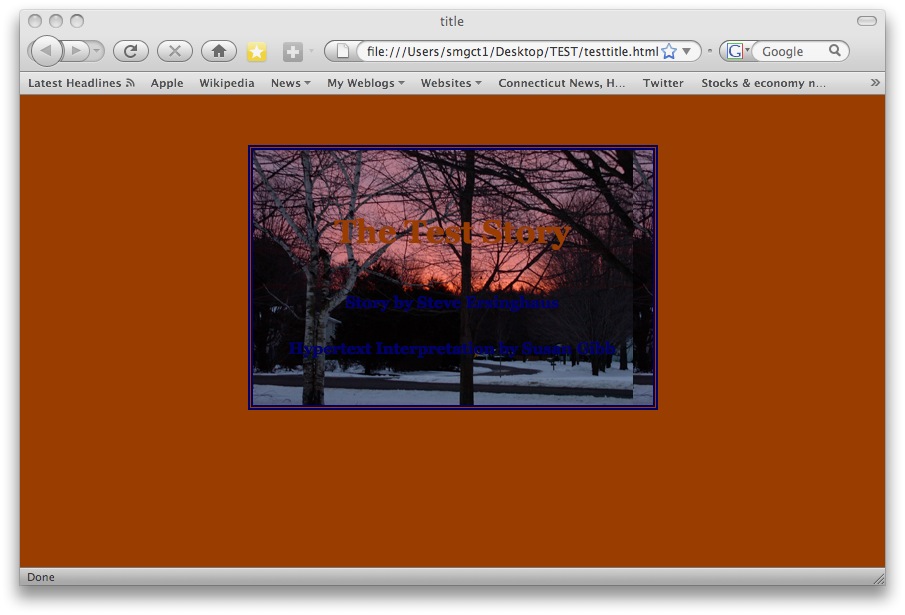
Now it’s not working exactly the way I want it to since it looks like the image as background code may have applied to all the templates, overwhelming the solid color background, but at least I know that finally the simple direction is working–I had no idea why it hasn’t (for the last week and a half).
The problem of applying it to only certain template pages won’t be all that difficult to do.
One of the fun things about learning something new on a self-taught-but-an occasional-question-to-a-wiser-friend-basis is that you come up with some weird stuff:
What I’m trying to do is put some more information directly into the  Storyspace template so that I needn’t go through all the files when the writing spaces have become .html files arranged in alphabetical order with no way (so far–I’m working on it) of knowing what links to what at a glance.
The image left has taught me that you shouldn’t use a 14 pt font unless you’ve already made arrangements in the css stylesheet for the headlines. For some reason, the export turned all the text into headline size. That’s okay, I’m working on a limited-lexia’ed piece as a test first.
This next little beauty is the result of trying to put the code into the writing space while in Storyspace to move a lexia’s eventual position on a web page. Evidently what I did didn’t work (okay, okay, so I’m working on this too) but it did make me laugh when thinking of the reason and possibility of hypertext and here I’ve got text escaping the boundaries of even that freeing element.
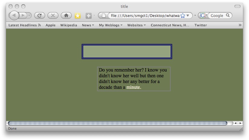
This is when you know you’re not quite getting it: I’ve been able to change the body background to an image, and able to change the background of the text within the borders to a different color, but not to change the background of the text to an image. But what I’ve learned from the below is that the image itself and the code for the image is not the problem:
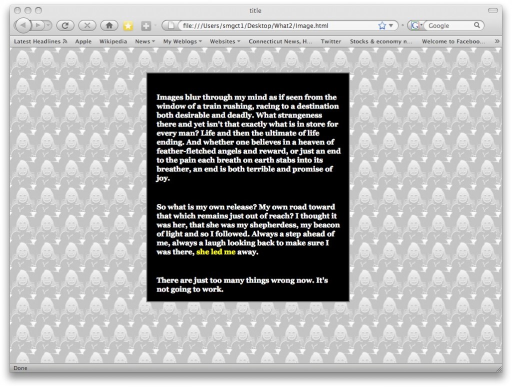
Still playing with possible solutions to the layout since I really want to know what works and what doesn’t before I need to depend upon it. Placement is going to matter as much as color and text to tell a story that’s dependent upon links and relationships.
Haven’t gotten the knack yet of the <style type=”text/css”> background-image: url (“what4copy.jpg”); </style> but I suspect it may be dependent on the image and size. Meanwhile, I have my #centerlarge column:
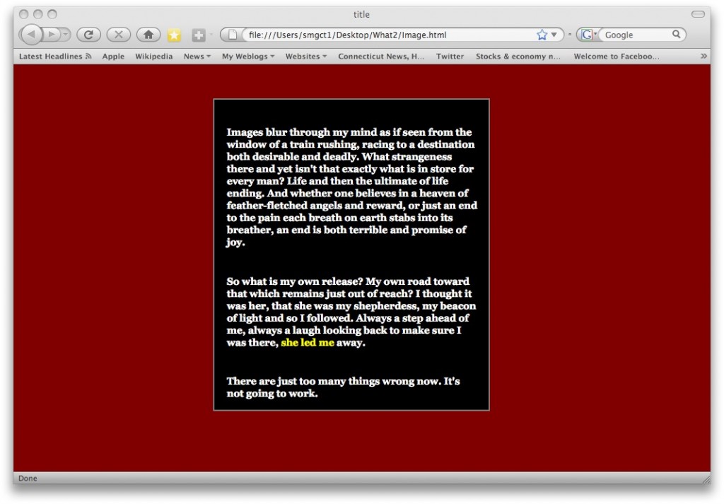
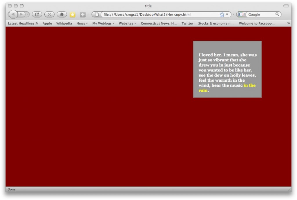
Oh goody–one more feat accomplished; figured the way to put a different color behind the text within a column, or block. All it calls for is this code in the <head> section of the individual html, without any change in the css sheet:
<style type=”text/css”>
#right {
background: #999999;
}
</style>
There are two things that bother me online and it’s possibly overcome by skill that ole dopey me hasn’t developed yet, but 1) I’d like to do away with the portion of the URL in a box to insert a hyperlink; that “http://” that makes you either double up the http://, or have to backspace and delete it because it’s so much easier to copy and paste the entire URL rather than pick it away from its beginning.
2) the two-letter state designations in drop-down menus that take a whole lot more time and effort than typing those two letters in directly.
Nice setup here and it looks perfect for a hypertext story in the many odd-sized writing spaces in so many different positions but…
Would they behave if the boxes were to show up singly or in small groups? Methinks not, since they appear to be co-dependent.
Just realized that any of my progress with html in What Was That 2? doesn’t work in IE. No borders. No proper color text. No columns. Something I did after I did what worked made it unwork.
…two scenarios in the learning of html and all that. The first is a minor quirk whereby the right (third) ‘column’ begins below the center when there IS a center column, and I think that may have to do with the margin setups I put in but for now that’s not a priority. I’m also looking into the grid layout as a better alternative to this structure since then the placement of text or image can be wherever I choose rather than dependent upon its buddies.
The second thing I’m working on is the background-image: url (“http://susangibb.net….jpg”) to replace the solid colors either of the whole page, or within the specified bordered areas. This one seems just out of reach because it should be simple and I’m getting close to the resolution but not quite there yet.
Meanwhile, in the background, I’m reviving the Storyspace piece Pigeon and Shoe with new characters and considering what to do about Paths.