Archive for the ‘HYPERTEXT PROJECT 1’ Category

HYPERTEXT PROJECT 1: Whoopsie!

Saturday, October 30th, 2010


A Bottle of Beer has been one of my most worked-on, revamped, and favorite hypertext stories and it’s great to have it in its most technologically advanced form yet. As I was all set now to wish it luck and wave it out the door I realized with surprise that it’s already made the rounds for submission  in its earliest forms to the few places that accept and present new media work.

Whoa. The years have flown by. There are a couple places where I haven’t sent it out but they are sites where it’s not really a good fit–even I know it before the editor’s gentle explanation returns it to my doorstep.

So while I’m still glad I’ve done all the work to bring it to this level since all writing and learning procedure is a step up on the next piece, it’s sort of sad that it’s just going to sit here unseen. So on to the next, I guess.

HYPERTEXT & CODE: Why a little knowledge is dangerous

Friday, October 29th, 2010


In trying to solve my image problem (not my personal image; that I’ve come to gradually accept) I of course found a round-about more difficult and time-consuming solution.

Since I wanted the images to be centered within the boxes, and since they are linked out of text or stretchtext, changing the margin edge by the code I showed in the previous post didn’t work unless the image was the only stretchTarget. Otherwise, the new margin set changed the text as well. Soooooo…

I worked around the code problem by making the images the smaller size of 400 pixels in Photoshop, made up a new file in Photoshop with a 550 width (as the images were marked, to give a 25 px each side border), painted it black (the background color of the piece, both column and body in A Bottle of Beer), and dragged the Photoshop image onto the black background and centered it, figuring in advance based on the resized image to leave a 10 px top and bottom margin and resulting in 75 px side margins. And, it works.

Of course as usual, I’ve solved an immediate problem for a particular piece of work rather than learning the right way of doing things by taking the time to look up the code scenario. It just seems that if I sit and figure things out logically, play with the code or find a way around it, it not only produces an answer, it’s a lot more fun. Somewhere in the future I’ll need to do this again, only it won’t work with the particulars and elements of the new piece.

That’s when I hope to have learned the right way of doing things.

HYPERTEXT & CODE: Safari as Prime Browser Check

Friday, October 29th, 2010


So far, Safari has been able to point out various HTML errors that Firefox automatically appears to override and fix.  I’ve used Firefox and like it, but when working on a hypertext piece that’s going to go online, it’s become obvious that you need to pick one of the pickier browsers to work with.

What worked beautifully in Firefox didn’t work with all browsers. I have FF and Safari on the Mac–which is naturally where I’m working since I use Tinderbox to start the piece out. On my PC, which I rarely use but have for backup and to hold all the years’ worth of stuff pre-Mac, I use Internet Explorer as the default browser and have since downloaded Chrome and Opera. That gives me two operating systems and five browsers to check the work. Also, I might add, different screen resolutions because of the various monitor sizes. This led to the last problem I need to deal with, the background images which looked great on my Mac, but fell a couple hundred pixels short on the PCs.

Safari’s refusal to accept font color tags unless they were posted before each paragraph of hidden or stretch text (in a group of three paragraphs, the middle one would return to the main text color) was similar to one of the other browsers that would only take the first paragraph and then return. I’m sure there’s a more professional way of doing this–which is why I wish I’d learned coding from the basics instead of jumping into the middle–but I did manage to fix by tagging each paragraph.

The problem of an uncentered image on the first page, where I inserted a 400px wide image instead of the 550px, I had used the proper code within the head:

<style type=”text/css”>

.stretchTarget {
margin: none;
margin-left: 100px;
}

</style>

It wasn’t until I studied another page where I’d done the same thing in stretchtext that I discovered I had changed a headline size from h1 to h2 but hadn’t changed the closing tag. (The image came from the linked headline) and so even though the headline was okay, it messed up what followed–the image.

So while I’ll likely still work in Firefox, I’ll know enough to doublecheck immediately each page in Safari as I work. Of course the best way would be to run the pages through the W3C Validation Service, but that shows me that my pages really have no right to be working at all and just makes me feel bad.

HYPERTEXT et al: Almost There

Thursday, October 28th, 2010


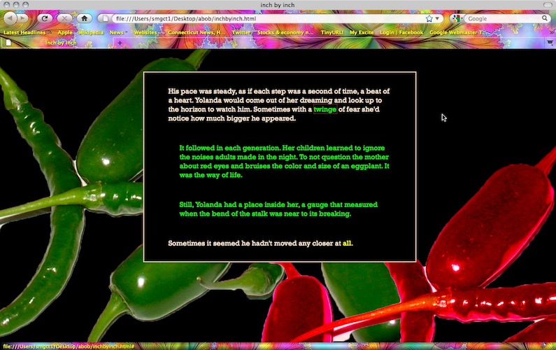
Have finally spent some time yesterday on finishing up A Bottle of Beer. I’ve included images I’ve taken myself and Photoshopped into more artistically (some, not all are done well–I’ve gotten some confidence since several of my graphics have now been accepted for publication!) suitable visuals and managed to get them to “hide” and “unhide” via stretchtext.

It’s likely the “flashiest” piece I’ve done, and likely that is because it was first written into Hyptertextopia and that was their basic color choice–black background and brightly colored links. But it suits this piece, and while I’m tempted to explain that the colored text that is revealed via links are the themes and separate from the main (white text) narrative, I suppose I’ll have to “Barthesize” and let the reader figure that out. And love it or hate it.

I’m still working on the problem of the hidden text not remaining consistent in color in Safari and Internet Explorer. I’ve solved it by adding the font tags to each paragraph. I’ve still to check if the stretchtext works in IE and Chrome. It works properly in Firefox (which is what I use) and in Safari so far. (UPDATE: Chrome showed up two open font tags but everything else was okay–odd that Safari and Firefox automatically closed them. Also, in working on the other PC with a larger screen, didn’t realize my background images set at 1280 x 800 weren’t sufficient. Have to work on that so that not too much relevant stuff is cut out on the right hand side. Maybe need to float or code to fit screen?) (UPDATE #2: Downloaded and tried Opera and everything works.)

Learned a lot, and am happy that this piece–aside from the tweaks and maybe some image changes–is finally displayed at its best.

HYPERTEXT et al: Fun with Photos

Wednesday, October 27th, 2010


I don’t have the kinks worked out yet about hidden images linked from hidden text, nor the different browser display of any images at all, but I’m giving myself a break and playing in Photoshop with some of my photos I’ve selected for A Bottle of Beer.

Still playing around with size and placement, but this is the fun part:

HYPERTEXT & STRETCHTEXT et al: Ah, the problems start…

Sunday, October 24th, 2010


UPDATE: Did get the image to work, but only as the target from original text links–as opposed to stretchtext hidden text links. Haven’t checked it with IE and Chrome yet, but it works in FF and Safari. Haven’t done anything with the font color problem yet since it works in two out of four browsers and that’s likely an easier problem to fix.

Just when I thought I was hot shit getting all that stretchtext working properly I exported the piece to the site online and problems immediately came up.

While I work with Firefox to open the html pages offline, I still needed to see the flow of the narrative when sticking in the images on a more occasional basis, since once the stretchtext is in the Tinderbox form, I can’t see where they are (including them into the main text of the box from whence they emerge), and in the file exported to a desktop file, they are arranged alphabetically rather than by narrative flow. Once the pages were set with the stretchtext code and the font, sizes, etc. were pretty much decided and working, and Firefox opening the file on the hard drive worked the images open in stretchtext, then I exported the project online. And the fun began.

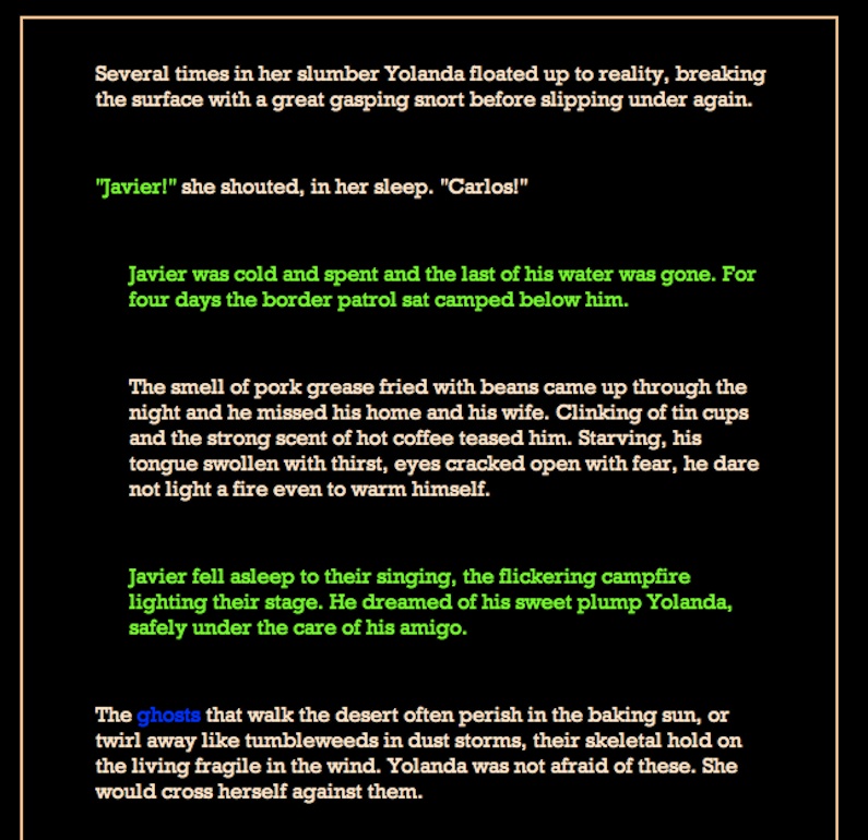
In Firefox, the images don’t show up. In Safari, something worse; the stretchtext seems to have lost it’s font color in the middle paragraph of three–though two paragraphs will hold the color:

Then I went over to the PC and with Windows XP and Internet Explorer, found that only the first paragraph held the font color while subsequent paragraphs returned to white, even though the closing font tag was not until after the last paragraph.

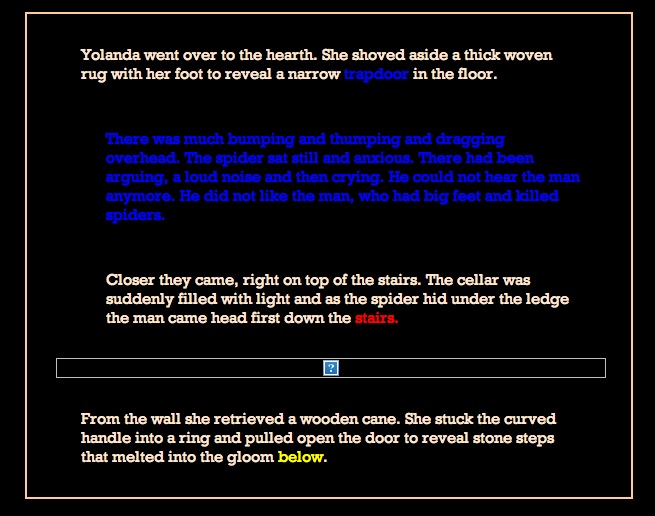
The image, in Firefox showed nothing, in IE and Safari showed the empty place-holder box:

So I downloaded Chrome on the PC. It handles the font-color code, but not the images. Chrome also didn’t display the Rockwell font very well, almost made it unreadable while it was fine in the other three browsers. So that’s four browsers and two of them have trouble with the font color changes and all four have a problem with the images. The colors, BTW, are your standard #ffffff, #000000, #ff0000, #00ff00, and #0000ff.  Looks like I’ll be doing some work on this today. But then this is one of my strong points, I love to track down problems and solve them. I’m just a bit slow.

HYPERTEXT PROJECT 1 & STRETCHTEXT: Making it all work

Sunday, October 24th, 2010


Had to export the new Bottle of Beer online to work with it since the new Tinderbox version doesn’t show the stretchtext and the html templates don’t show the hypertext flow. It’s easier to see where images might be effective in the linear flow of the work, and in the hard drive file of html pages, the files are alphabetical.

I do have a problem. While the stretchtext seemed to easily accommodate the images while I was working with the local files, once it was exported onsite, the images weren’t being called in. I’ve tried a couple different browsers (I use Firefox normally) such as Safari and IE, but so far, it doesn’t work. I’ve also changed the coding to reflect “url” though I’ve yet to type in the whole url, and I’ve changed the file location from a separate images file to standing within the whole “abob” file.

Switched the font to Rockwell which is a bit more readable in the colored text on black than Georgia was, and a bit more classy than the Lucida Grande I was using.

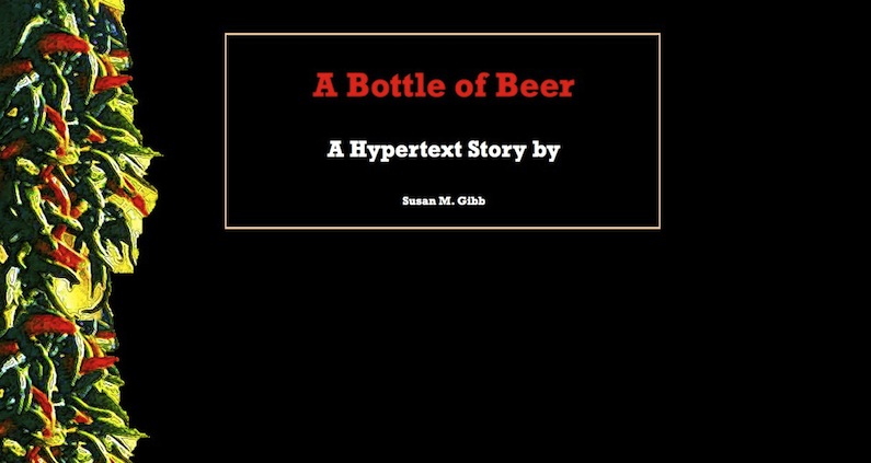
Found the no-repeat coding for the images on the background, though I still can’t seem to tweak the right lines to make the image go all the way across the screen nor have some top margin. But an alternate way of working with the background images is to produce a black screen in Photoshop and drag in the image and place it where I want it, such as this:

HYPERTEXT et al: Bits of Code Flying like Clouds

Friday, October 22nd, 2010


Though it’s my preferred method of learning, that is, getting an idea then having to seek the answer, it’s proving a bit unwieldy.

I’ve gotten the templates all done, all the stretchtext in place–at least for the text–and am moving on to once more changing fonts–that’s a snap–and size of the boxes, or borders.

Then I think of putting an image into the background, outside of the bordered boxes, occasionally. But I realize that I have a new css that doesn’t include the different columns, so the background of the body is the background to all. So that’s one thing to play with.

Then I’m thinking, maybe something different, like doing away with the top and bottom borders of the boxes which indeed suits the concept of stretchtext, but of course, needs some margin refiguring.

The idea of an image in the background is not a whole one that covers the page, as in Blueberries, but rather one that may peek from an edge, or horizontally boldly cross the page like a highway.

All this is what’s bouncing around in my mind, so many ideas, so many possible ways to code them in. Yet at some point I know that what I really need to do is start back from the beginning with understanding the codes of HTML and CSS and jQuery. Otherwise, just as with my prior project for the 100 Hypertexts of 2009, I’ll end up with stylesheets that run on forever, adding in each solution for each problem posed by a whim.

So here I am, anxious to get done with this project of revamping A Bottle of Beer, and while it’d be poised to go as is, wanting as well to throw new elements into it. And another problem comes in: I’ve three books on coding and only two hands.

With any luck, I’ll post the new version of ABOB soon, before I decide I want to have Mexican music in the background as well.

HYPERTEXT PROJECTS: Learning & Sharing

Sunday, October 10th, 2010


I’ve decided that with two intense hypertext projects going on, it’d be a good idea to categorize them separately so updates make more sense.

Hypertext Project 2 is going to be a sharing experience, a website and book that will offer the reading and writing of hypertext narrative in an easy and inviting manner before it becomes all academic and technical. I’ve laid out an outline for the project in Tinderbox and have just started to write down some text, though I’m sure I’ll be gleaning much of it from previous postings over the years that follow my own journey through learning.

Hypertext Project 1 is another learning experience, that of graduating to HTML5 and CSS3 (though honestly, I learned just enough of the previous versions to be able to do what I wanted to accomplish) and jQuery.  So far, I’ve learned to Fade In and Out, and the Alert. But then, I jumped ahead a bit to the more interesting parts, which is typical in my learning pattern: I was once caught by the music teacher as playing a piece by ear since I couldn’t point to the spot on the page where I was supposed to be.

I’ve remarked any relative posts as such (or will within a few minutes)

HYPERTEXT PROJECT 1: Readying the Story for Transitioning

Saturday, October 9th, 2010


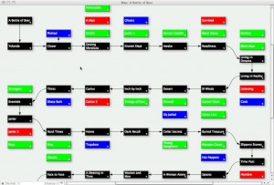
Just finished moving all of A Bottle of Beer into the Tinderbox format, and here’s the different views between the Storyspace version (left) and the Tinderbox version (right), both in Map View:

While the color and Note format is obvious, I’ve changed the layout of the sidenotes for a reason. The black Notes are the main linear story. The colored Notes–red, green, and blue–each represent a theme of this piece. Red represents the men in the main character’s, Yolanda’s, life; green represents past events; blue represents nature’s alliance with mankind. The themes do not have any linearity and so would not be connected to each other. They are random thoughts that are sparked by the slowly unfolding linear narrative. In the completed hypertext version to date, they are read by clicking on colored text links, and lead back to the Note from which they emerged. What I’d like to do instead, is have them appear on the page, fading in but not covering the main text. That is why I’ve put the piece into Tinderbox, and why the Notes are lined up with the main linear Note they belong with.

Now all I have to do is figure out how to do that. And that’s where my learning jQuery and the new HTML5 and CSS3 comes in.