Very good advice from A List Apart this morning on “The Elegance of Imperfection.”
“It symbolizes a crucial lesson about craft: utility is not contingent on perfection of form.”
Even as I fight back the urge to twiddle and tweak till I’m left with a toothpick of story from a oak tree of words, I do realize that editing and going that one step further does most often improve upon form. Utility is fine, but I still can’t help but seek perfection–perhaps as a balance to more natural impulsive instincts.
In working on the 100 Stories Project (which I really shouldn’t be doing, I suppose, until the official start date), I’m playing with colors to stay on track with the project as a whole. It is important, of course, to have something set up prior to the opening bell since there won’t be time later to play when deadlines to produce are more important, but after practicing the hypertext, I had to play with the display. And, after two major rehauls in display just to find something inspiring to write in, there’s still that urge to look further to come up with the perfect playground. In checking out the suggested site, Kular, for color theme, I found this that I do like a lot:
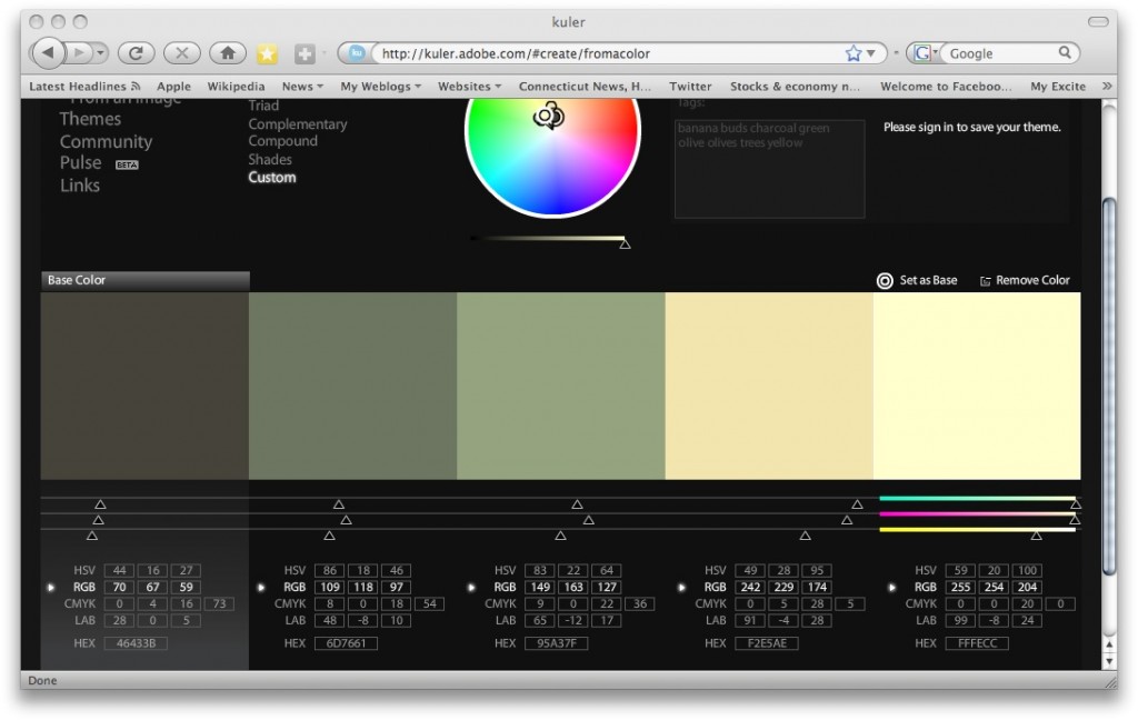
In changing the css color values on a test, I neglected to change the headline colors from a lovely navy and while the values above came out subtle and soft, the navy text fairly popped with class.
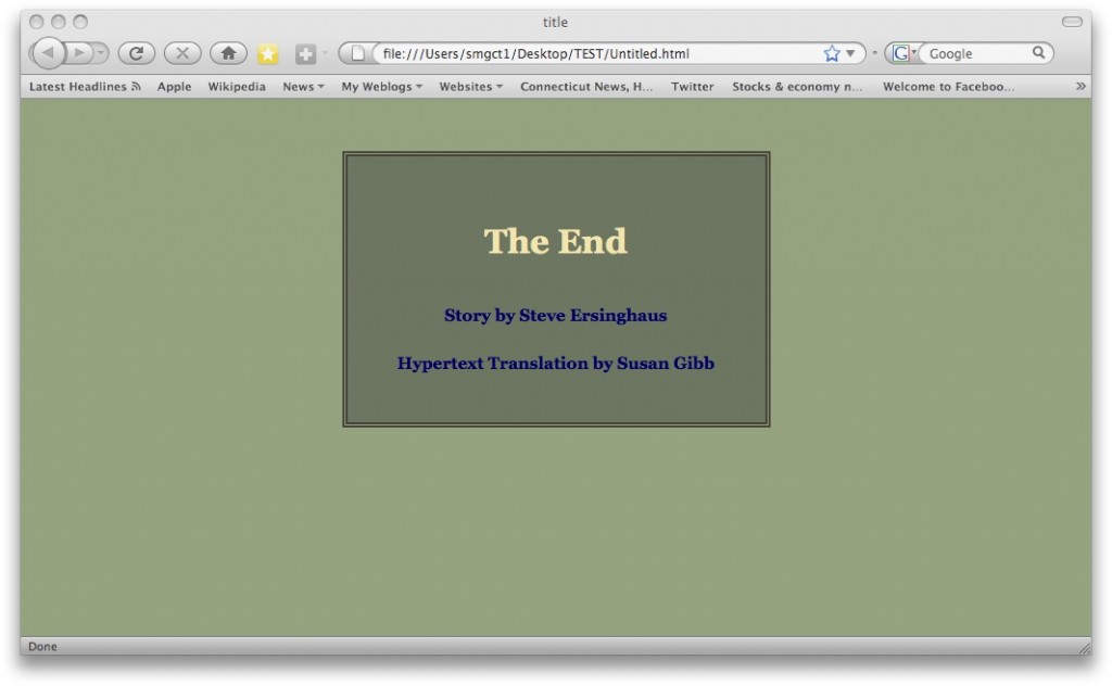
Then, of course, there’s thousands of color combinations and I’ll have to explore further before I go changing things again. But the above–with navy text–may show up somewhere someday soon. Like maybe at the Spinning site that’s gotten boring for me.
 I’ve decided to drop out of this summer project as far as doing a daily hypertext but as always, cheer on and support the Tunxis folks who will be involved in what promises to be a fun and creative endeavor. It begins on May 22nd and you can follow their progress here: 100 Days Projects


 The Lost Children: A Charity Anthology