With the latest piece for the 100 Hypertexts project I just learned something regarding link color. In most of the other hypertexts I’ve played with all kinds of color combinations and basically followed a theme of the active/hover link color was the same as the border and headlines, and the visited link would pick up the body (full page) color. The links were kept in mind in selecting color themes, and sometimes the link colors would need to be changed because they were too dark and thus too close in tone to the black text to be easily accessible. Likewise, in some cases, i.e., red, they may be too contrasty and thus distracting (okay, so maybe I left them that way but will keep the lesson in mind).
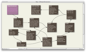
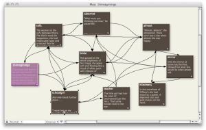
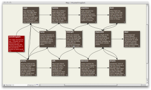
With #16 Imaginings, the active/hover links are a light grey on cream (since the dark grey of the border wouldn’t show up as obvious) and the visited links are the coral of the body. What this does is make the visited links more obvious and therefore more inviting to the reader. In most cases, this isn’t desirable; it would be like spreading out all the read pages of a book instead of merely turning them.
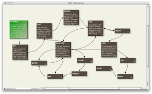
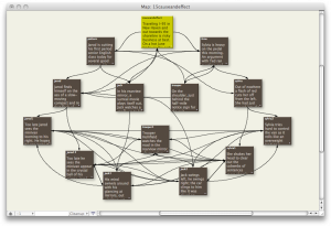
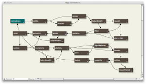
So I was naturally tempted to go back and adjust the colors and stopped, ran through the piece a couple more times and realized that in this story it was a good thing; I actually wanted people to go back to revisit links since most of the pages had several link options available. The story is probably the most non-linear of all the hypertexts (with the exception of #13 Connections) so there isn’t as much a case of the out-of-sequence annoyance that I find in reading and writing in the hypertext format.
I’m learning as I go.
 Magical realism. Love it, want to get more used to writing it.
 The Lost Children: A Charity Anthology