Even as I settle myself in for a nice hypertext write, I wonder where it all is going. Even I still have some dislikes of the medium in the reading of it, but then, there’ve been quite a few changes incorporated into hypertext work now. Even as I write in it I need these ‘changes’ to keep the groove, namely, to see the visual presentation and that for me usually means some color if not graphics.
This is also likely why I’ve still not bothered to master interactive fiction, as in the old text-interplay of Photopia, et al. It’s not visually exciting. Particularly when seeing “There’s no such thing” a few zillion times (I happen to be certified directionally dysfunctional). When I first got into IF and then hypertext via Storyspace, my mind zoomed ahead to a combination of the two–never the concept of IF alone–and with images and sound as well.
Now I’m not quite a senior citizen but I’ve been raised in the era of television at least, so I’m used to the visual saturation of the senses–though books were still a big, big part of my list to Santa. It makes one wonder how the younger generations, brought up on laptops rather than mere laps in a rocking chair, feel about these forms of story when they can get film clips on their phones for goodness’ sake.
A couple of years ago I played around a bit with Chris Crawford’s Storytron, in beta form, more on the authoring side of things than on the reading and playing of the prepared story. At that time, unless my mind is deceiving me, there was a very promising graphical interface that was highly sophisticated to go along with the program. When I checked out Storytron in the last couple of days after its launch of a fully useable program, I was surprised to see the same old Sponge Bob Square Pants figures (faces?) in the play areas. While Storytron is sort of halfway between IF in its decisions and hypertext in its manual use of clicking menus, it doesn’t do much in the way of eye-appeal. Same thing with the promise of Facade, which hasn’t progressed any from its intial output and primitive visuals. Why are some of these great concepts not really accepted by a much wider audience? Somehow I believe it has something to do with needing to look as exciting and interesting as the content should certainly be.
Like I said, I may often opt for the classics in their physical text and creamy-paged form and a quiet corner with a soft-cushioned curl-up-type chair, but I still have come to expect some visual stimulation when it’s just my Mac and me. In this hungry-eyed era I would think that aside from story and good solid writing another major consideration needs to be presentation.
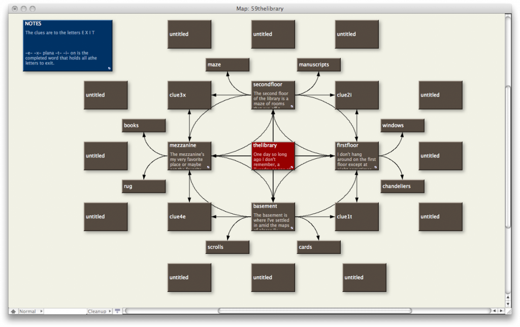
 This is the Tinderbox map of Hypertext #59 The Library. What I’m planning here is a sort of IF influence on the piece by incorporating a quest, or task, separating the library into rooms, and providing clues within the stories that will lead to a successful ending.

 The Lost Children: A Charity Anthology