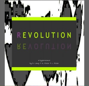
 I’m always thrilled when literary hypertext is published, particularly by a magazine that isn’t driven by new media. What I mean is that by including hypertext pieces among their static text offerings, the magazine not only displays an open-minded attitude towards alternative presentation, it widens the potential audience by exposing literary enthusiasts of traditional story and poetry to a different form.
Dorothee Lang, writer, photographer, artist, and editor of the Blue Print Review, teamed with Karyn Eisler, another multi-talented artist in many mediums, and Karyn’s brother Lawrence Eisler, an illustrator and designer in new media, for a hypertext poem that’s visually exciting and well planned out.
Published in the current issue of Wheelhouse, (R)Evolution is a journey that allows the reader to choose the narrative path. As Dorothee explains it,in comparing it to a piece called Poptagon which was published at Locus Novus:
Poptagon had a linear structure: every page leads to a defined next page.
(R)Evolution, in contrast, has “crossing”-pages that come with a choice, with options for the way to take. the curious thing is that there in fact is only 1 main “crossing”, and 2 sub-“crossings” – it’s really a simple hypertext form. yet when working on it, it took a sketch to be able to keep track of the structure, even though the whole thing consists of “only” 7 pages, plus title and ending pages.
The piece begins in a garden which the speaker compares to a shopping mall, where the flowers are selected by occasion, where she stands at the ready with shears prepared to clip blooms. This notion of choice is mimicked by the concept of hypertext where a choice can be given, a decision can be made, but an interaction with the piece is required of the reader.
The question of choices brings questions, the gardening bringing to mind the relationships with others. The metaphors in the piece extending flowers into words, manipulated again in the same manner as this hypertext piece.
The different pages of the poem are painted in visuals that are bold and contemporary. Here the text is designed into the image, enhancing and reinforcing the movement of the piece. Circular, forcing the reader to adopt an entirely new pattern of reading than the norm, sideways, mimicking stems or offshouts of the main stem–another shout-out to hypertext form. This piece takes readers out of the comfort zone into a more interesting and easy enough to negotiate concept.
A really beautiful collaborative effort by these talented folk that I thoroughly enjoyed reading, and I’m so pleased to spread the word.


 The Lost Children: A Charity Anthology