HYPERTEXT & CODE: Fiddlin’ with Design
This site for now has become a journal of learning the behind the scenes creativity necessary to bring any hypertext narrative efforts on my part to the process of production and accessibility. In other words, I can write the story, but it’s got to be displayed for public reading and up to now, for me that was a problem.
So I got beyond the procedure of exporting Storyspace work into an online site, set up a site that accepts it, and now am working on presentation. So while it may look extraordinarily silly to thems that already knows, this journey is an important one to me–if not for me, and the purple plague picture below this post is just so for a purpose.
I think that working with this short, unfinished piece (What Was That?) is the easiest way for me to learn all the different options available. The purple and aqua color choices are strategically marking this as separate from the more subtle original format. In the post below, the opening space of the piece includes title, image, and text with a hyperlink. I’ve separated each out into separate columns set up for placement–at least vertically; something else may work better to allow horizontal placement as well. And, all three columns are represented–which is not something I really feel I’d be using, but rather single or two at the most–but it does bring up the question of outer margins and spacing so that the borders are separated. I may need to look into going over an 800-pixel body width. Does anybody use 800 anymore?
And the black line at the top: that’s just an empty body border that I’ve since taken out. Hey, I’m sure this won’t be the ugliest hypertext space I produce in my trial and error learning!
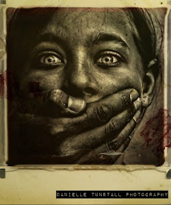 The Lost Children: A Charity Anthology